Positive self-starter, working in a fast-paced environment; well-balanced and efficient work ethic. Skilled in creating intuitive user experiences across platforms. Driven and innovative, eager to work with teams and/or individually to create excellent work.
CASE STUDY
Adaptive Dashboards & Analytics

ADAPTIVE Suite
UI Refresh
PRODUCT DESIGNER
Design strategy, research facilitator, testing, UX/UI design
MY ROLE
When I joined Adaptive Insights, the UI refresh project was in the production phase for Sheets. I participated in various efforts, finishing up Sheets completion. Then we continue to redesigned Reports and Process Tracker.
An old model
WHAT I STARTED WITH
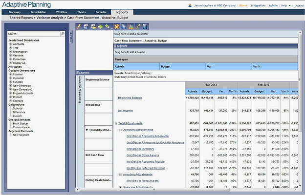
This is what our product looked like when I started. It was dated, required much clicking, and the workflows were quite convoluted. Besides, asset maintenance was frustrating, with over 500 icons spanning at least 4 different styles.
This screen was used to build a report. Unfortunately, there were pretty big discoverability issues around building hierarchies of accounts, inconsistent navigation, and hidden functionality.

Exploration
A/B TESTING
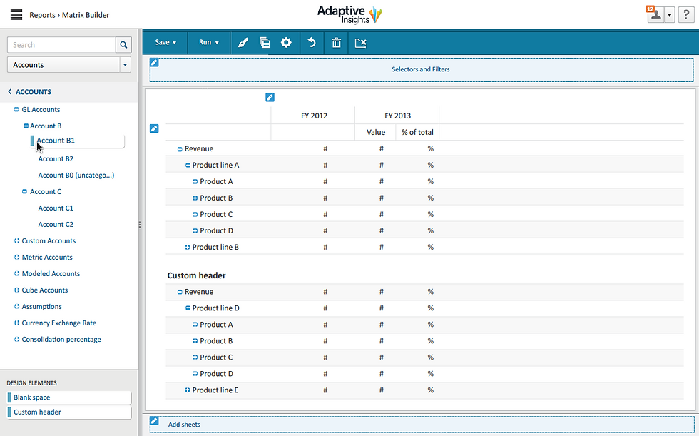
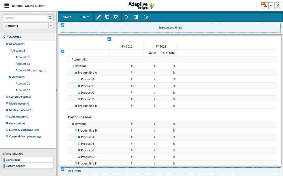
In addition to re-working existing functionality, we were also tasked with looking at new ways of presenting data to the user. We came up with a couple of design concepts for Adaptive Reports and validated with end users. This helped us to provide the right features and contents that would satisfy their wants and needs.

TRUE WYSIWYG DEMO
Pros
-
Simple and frictionless
-
Formatting is easy to comprehend as it is direct
-
Less confusion between the interaction between the areas
Cons
-
More complicated to design and probably more complex to build
-
The very complex report can be hard to manage
-
Harder to edit structural components
Notes
-
Figuring out the details of how building works requires lot of prototyping and testing
-
Unknown whether this can support all types of builders and reports


Report Builder

Process tracker
As same as Reports, we came up several concepts for Process Tracker, then conducted A/B testing to see which reflected the needs: daily tracking or simply just roll up totals.
Test & Iterate:
-
We tested early and frequently, starting with paper prototypes, then moved on to wireframing and visual mocks as we iterated
-
The final rounds of design were tested as click-through prototypes built with InVision
THOUGHTS & LEARNING
TEAMWORK & COLLABORATION
We collaborated closely throughout the project with Product, Dev, and different teams. One thing we found was so valuable was the morning workshop. Every morning, we invited everyone to come over to the design corner to casually view and chat about what we had worked on that day. Through these conversations, we could get people interested in design and give feedback more organically. It also helped us built a great working relationship with other team members in the company.
LEAN DESIGN
Inspired by the Lean Design Principles, we were able to achieve a lot with limited resources, 2 UX and one contractor, in a short amount of time. We started testing with paper prototypes for quick and fast iteration. The idea behind this was not to get too attached to our design to a point it would become too precious to change.
DESIGN SYSTEM
Design holistically with a design system in mind allowed us to scale. We componentized our design and moved straight to click-through prototyping with InVision while in the visual design phase.


